Alert
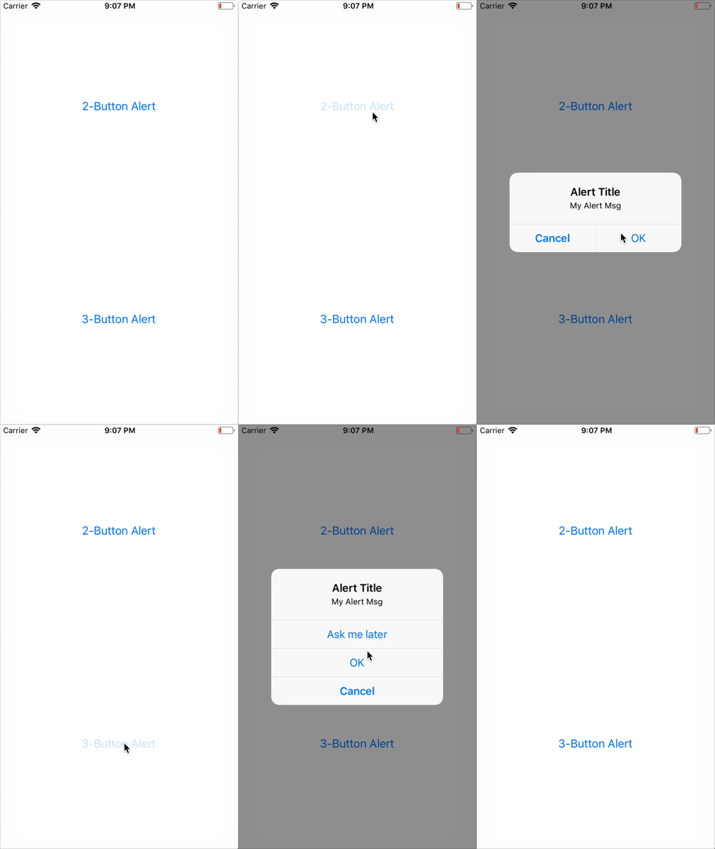
Launches an alert dialog with the specified title and message.
Optionally provide a list of buttons. Tapping any button will fire the respective onPress callback and dismiss the alert. By default, the only button will be an 'OK' button.
This is an API that works both on Android and iOS and can show static alerts. To show an alert that prompts the user to enter some information, see AlertIOS; entering text in an alert is common on iOS only.
Example#
| iOS | Android |
|---|---|
 |  |
iOS#
On iOS you can specify any number of buttons. Each button can optionally specify a style, which is one of 'default', 'cancel' or 'destructive'.
Android#
On Android at most three buttons can be specified. Android has a concept of a neutral, negative and a positive button:
- If you specify one button, it will be the 'positive' one (such as 'OK')
- Two buttons mean 'negative', 'positive' (such as 'Cancel', 'OK')
- Three buttons mean 'neutral', 'negative', 'positive' (such as 'Later', 'Cancel', 'OK')
By default alerts on Android can be dismissed by tapping outside of the alert box. This event can be handled by providing an optional options parameter, with an onDismiss callback property { onDismiss: () => {} }.
Alternatively, the dismissing behavior can be disabled altogether by providing an optional options parameter with the cancelable property set to false i.e. { cancelable: false }
Example usage:
// Works on both Android and iOSAlert.alert( 'Alert Title', 'My Alert Msg', [ { text: 'Ask me later', onPress: () => console.log('Ask me later pressed') }, { text: 'Cancel', onPress: () => console.log('Cancel Pressed'), style: 'cancel' }, { text: 'OK', onPress: () => console.log('OK Pressed') } ], { cancelable: false });Reference
Methods#
alert()#
static alert(title, message?, buttons?, options? type?)